It's so much better than the club logo:

I'll grump some more about this
I saw in the most recent newsletter that an order of Monkey Mirrors did not sell as well as expected, and there was some thought that the Freewheeler logo, above, was part of the reason for the lack of interest. I cannot speak for anyone else, but that's the reason I didn't get one. As a long-time, irritating mirror advocate, I would certainly have gone for a club mirror, except for that graphic.
My other complaint about the club graphics is that they frequently make reference, direct or indirect, to Princeton University. I'm careful not to claim affiliations to which I'm not entitled. So an item with the name "Princeton" on it, which is orange and black, or which refers to the tiger mascot, seems to me to pretend to such an affiliation.
I'm not now in the market for a jersey. I've got more than one orange one, but they don't say Princeton (and no one would mistake my most recently-acquired orange jersey for a University-affiliated item).
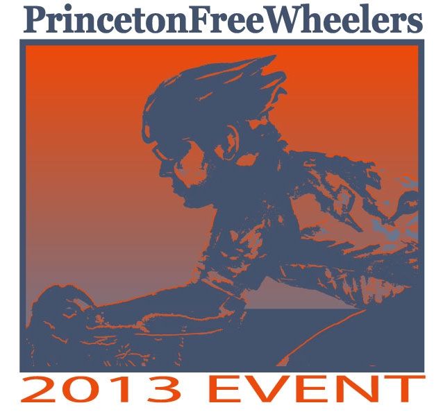
When I AM in the market for a new bicycle jersey, I'm more likely to go for one with a graphic similar to the one for this year's event, rather than one with the current logo.
As for avoiding inadvertent affiliations with Princeton University, I'm fairly sure I'm the only person in central Jersey who feels the way I do. de gustibus...
No comments:
Post a Comment